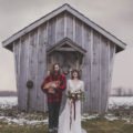
Berkeley Fieldhouse Wedding
June 17, 2016
Eunice and I met a few years back before she was engaged. One day she said to me “April, if Rob and I get married, I can’t decide if you should shoot our wedding or style it. I love how you do both.” I laughed and told her she had to choose one, but I would love the opportunity to style her wedding since we have the same esthetic. I really wanted to announce the opening of Olive Studio’s new service with her wedding; and that is wedding planning and styling.
Over the past few years, I have gotten my WPIC certification and have hired on my wonderfully talented cousin, Lauren Maciborka as my in house wedding planner. I too, have the ability to plan but I much prefer keeping it creative with the styling or shooting.
A year later, Eunice was engaged and I was booked to style her wedding on June 17th. I helped Eunice plan and style her big day, and even shot the details below of all the DIY projects custom made for Eunice and Rob.
Even though Eunice and her fiance knew me before we started working together, I would have to say that we didn’t really form a friendship until we started our wedding planning and styling.
It was easy for us to come up with ideas that we both loved because we have such similiar tastes. Once Eunice reported to Rob, and he had his input, we would then start our crafting!! Countless hours turned into days and weeks of crafting projects over a year in preparation. Some inspired from Pinterest and some from our head; we created our dream wedding together.
First, Eunice and Rob described what they were looking for and what their overall theme was. They wanted the wedding to be romantic, down to earth, feeling like they were bringing the outdoors in and overall, a great focus on family, friends and a fabulous party!
I asked Eunice and Rob to start with a colour scheme that they enjoyed and a pinterest board of looks they liked. Eunice started off telling me she wanted emerald, peach, gold and white as her colours, however when she sent me her pinterest board, there wasn’t peach in sight! She actually was drawn to white, green and metals. She just thought that she had to have another accent colour. With my encouragement, I told her that the natural colour scheme she chose, would be complimentary to the venue and to the couple. So in conclusion, we then chose a colour scheme of emerald, mixed metals, natural woods and white. Eunice really wanted an organic and rustic vibe emphasizing on natural elements like wood signs, vintage frames, and green garlands. She loved the look of huge and dense floral garlands too, but decided to forfeit the blooms to save some major money. Since the Berekley Fieldhouse has beautiful natural light, silver chairs and accents, we decided to mix metals so that we could also introduce Eunice’s love for copper and golds.
Now I will explain how we created our many custom DIY’s.
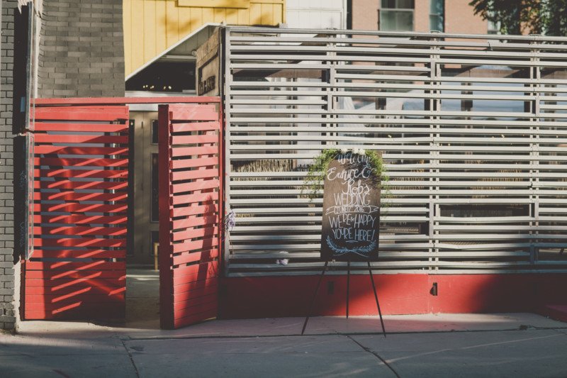
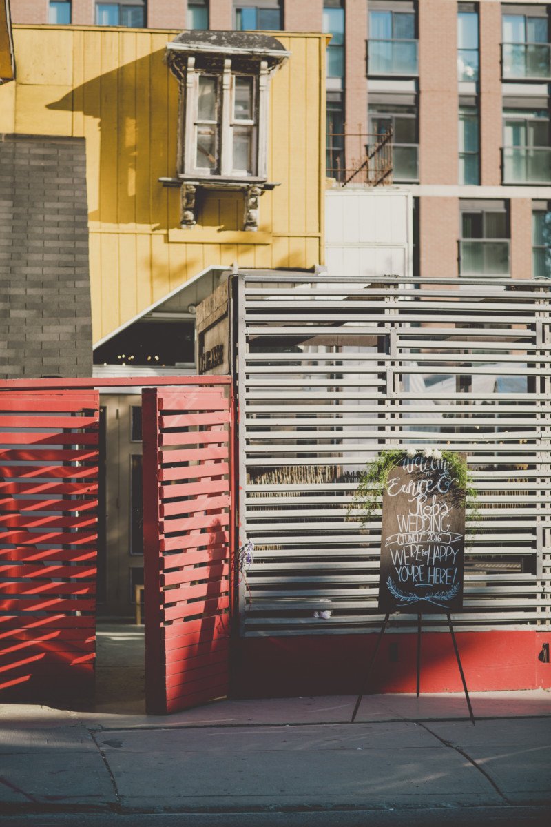
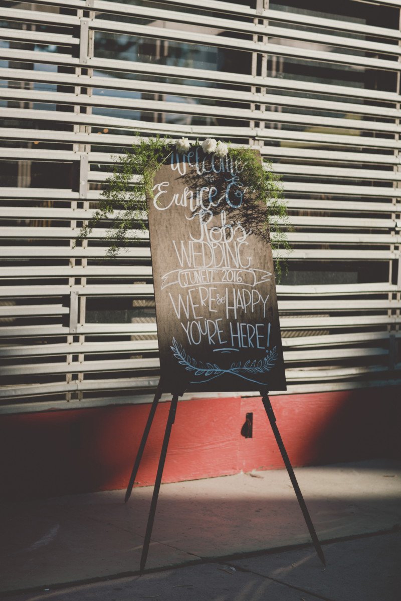
ENTRANCE SIGN
The first detail that was to catch the eye of entering guests, was the huge wooden sign painted and created by myself. This DIY was fairly easy to do. A piece of grainy oak wood was purchased and stained and then my attempts at a romantic cursive font was pencilled on. After I painted the cursive in with a small angled paint brush and white acrylic paint. The board was propped up on an easel and finished with some asparagus fern and some blooms.
SIGN IN BENCH
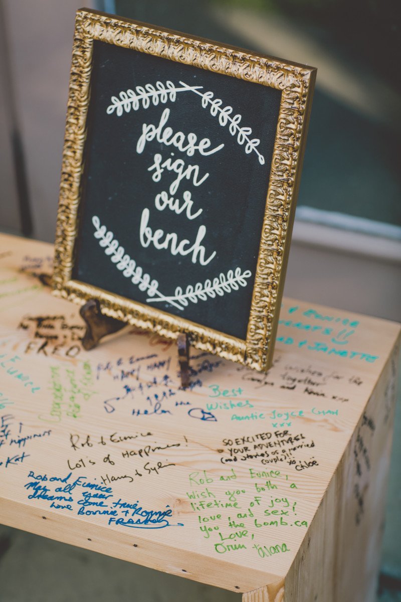
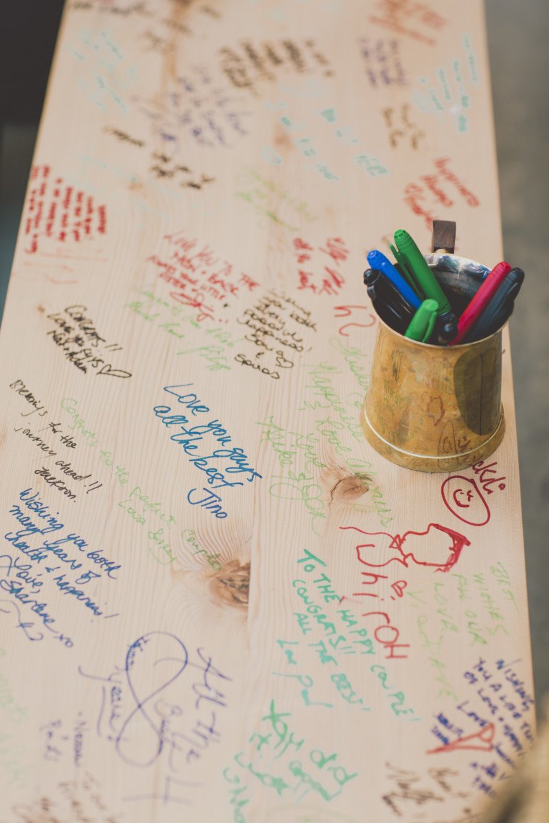
The couple opted for something different for their sign in book. They wanted something they would use in the future, and that was a bench! An incredible industrial designer I know was commissioned to create the perfect simple and modern bench and it looked stunning! Guests were able to sign it and once the couple shellacs it, it will be a permanent and individual momento.
SEATING CHART
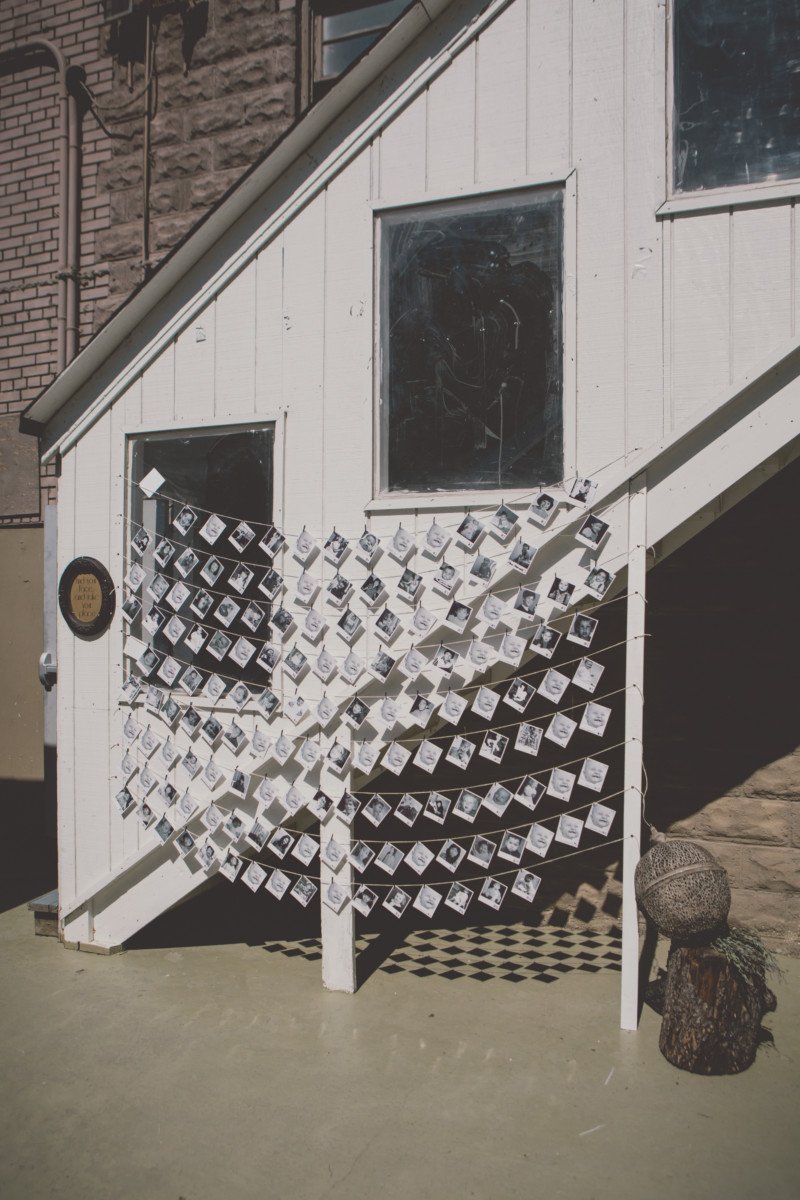
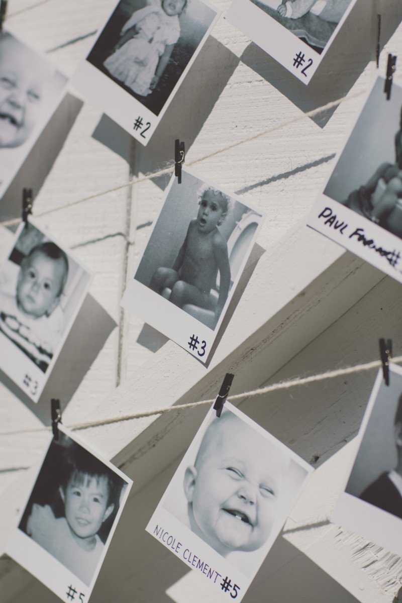
When guests entered the outdoor cocktail space, their eyes were drawn to the outer stairwell wall which is painted white. I strung organic string from one end to the other, fastening it with huge metal thumb tacks on either end. I then clipped polaroid photos of each guest as a baby or child with a table number written on it. This would service as a fun game for guests to find themselves as a child, and also identify which table number they would be seated at. The guest was also meant to take their polaroid as a momento and as a seat identifier.
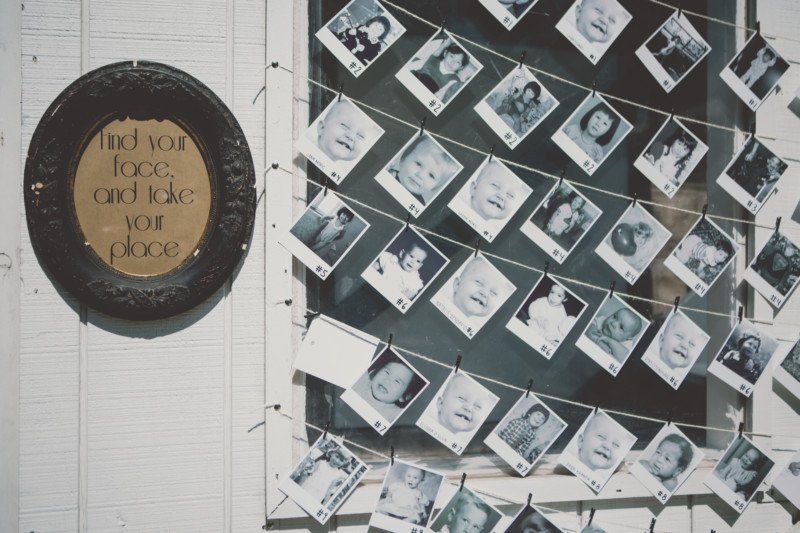
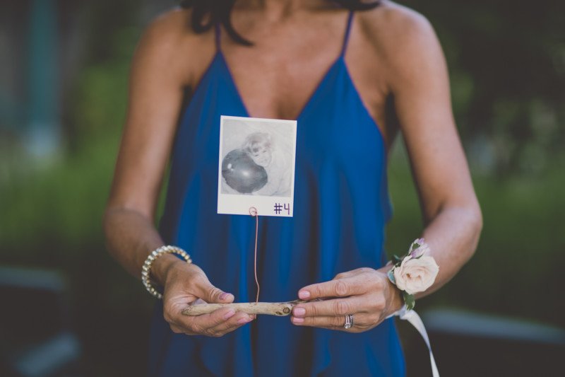
Eunice had the intensely tetious job of trying to find each guests baby photo on fb and eventually emailing the ones she couldn’t find for a photo. I then changed each photo to b+w and got a company called Snap to print these sweet baby polaroids. There were a handful of guests whose photo we did not receive for countless reasons, so we used a funny generic baby picture. For those who receive the generic, we had to write their name in addition to their table number. (homework is never fun for everyone 😉 This was one of the most time consuming diy’s but totally eye catching and jaw dropping worth it!
WELCOME DRINK STATION
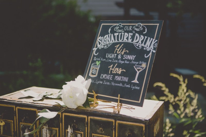
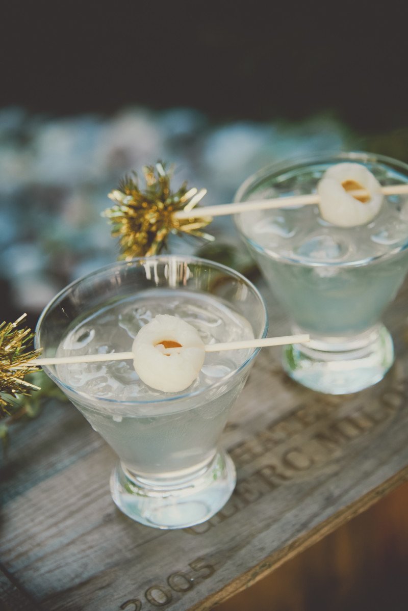
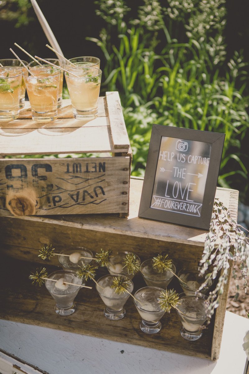
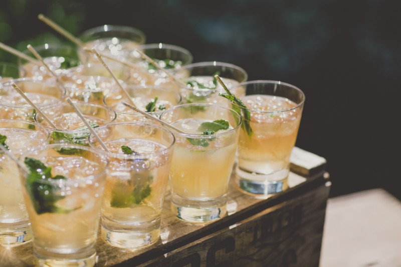
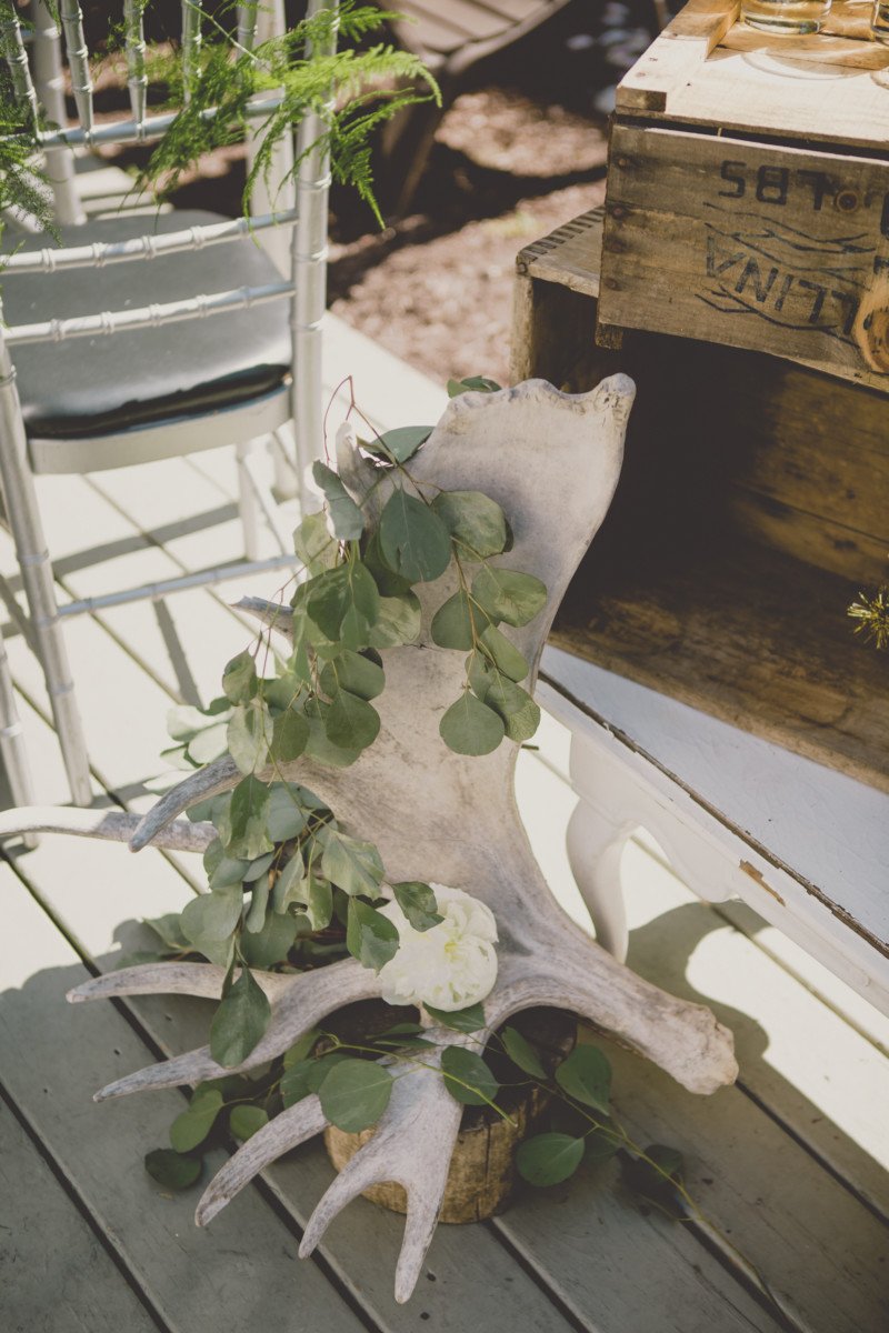
Eunice and Rob wanted their guests to be greeted with a Welcome Drink before they were seated at the outdoor ceremony space. Rob chose the “Light and Sunny” and Eunice chose a “Lychee Martini” which were all pre-made and displayed on my collection of antique boxes and gorgeous vintage mailbox.
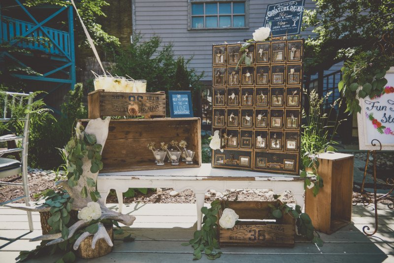
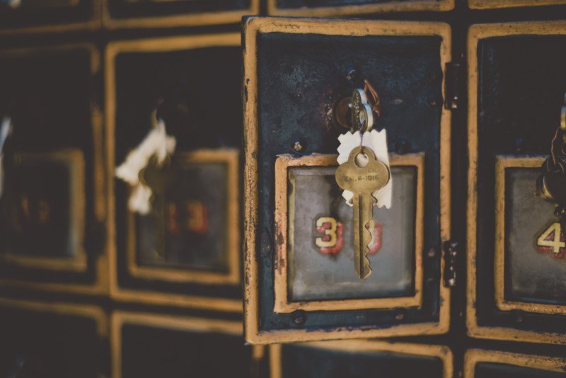
Eunice made the sign with chalk marker and I decorated the station with ruscus, my moose antler and topped off the drinks with their signature “his” or “her” drink stir stick. The lychee sticks were decorated with a gold tassel and a skewered lychee and the Light and Sunny’s with gold glitter and mint.
FLOWER CROWN STATION
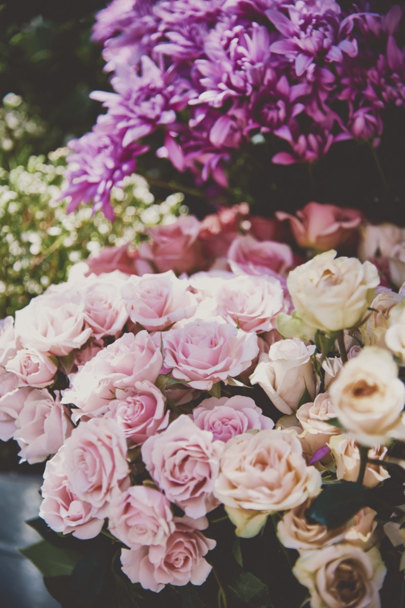
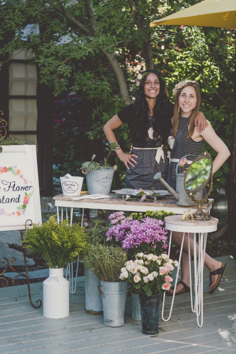
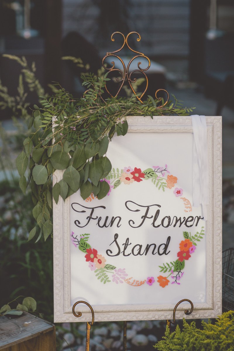
Eunice really wanted the guests to have something to do during the cocktail hour as well, so her friend and owner of Fun Flower Stand came to make flower crowns for guests which was a huge hit!
CEREMONY CONFETTI CONES
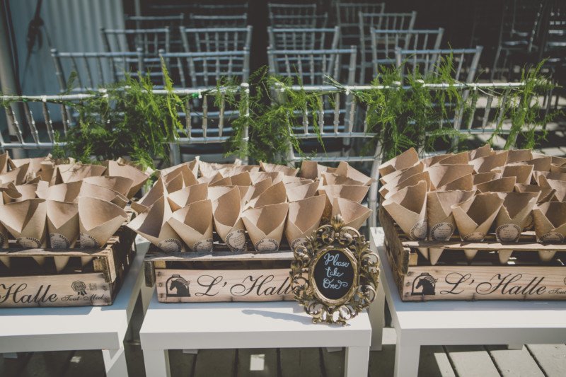
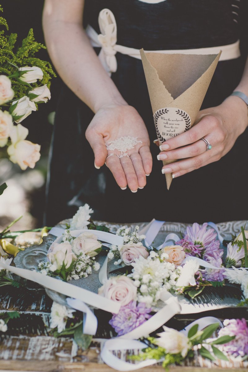
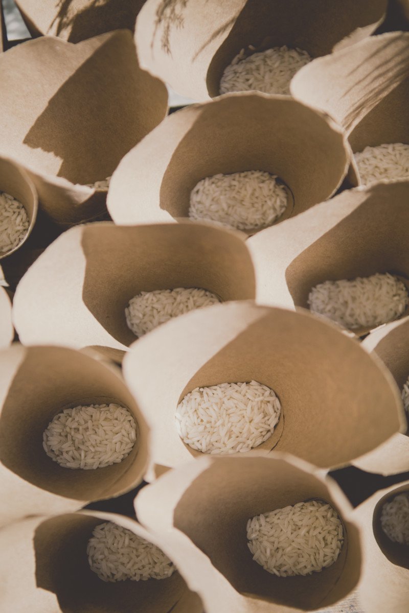
Regrettingly, we chose rice as our natural confetti option for the ceremony which turned out to be Rob and Eunice’s personal nightmare when they were targeted with hard rice grains after their vows. Ouch!!! (we thought it would be natural and cheap but the pain was too great). We cut squares of kraft roll paper and rolled them into cones, sealing the cone together with a custom logo sticker that I designed. Looking back, perhaps filling them with leaves would have been a prettier and less painful option.
ALTAR FLORAL GARLAND + CURTAIN
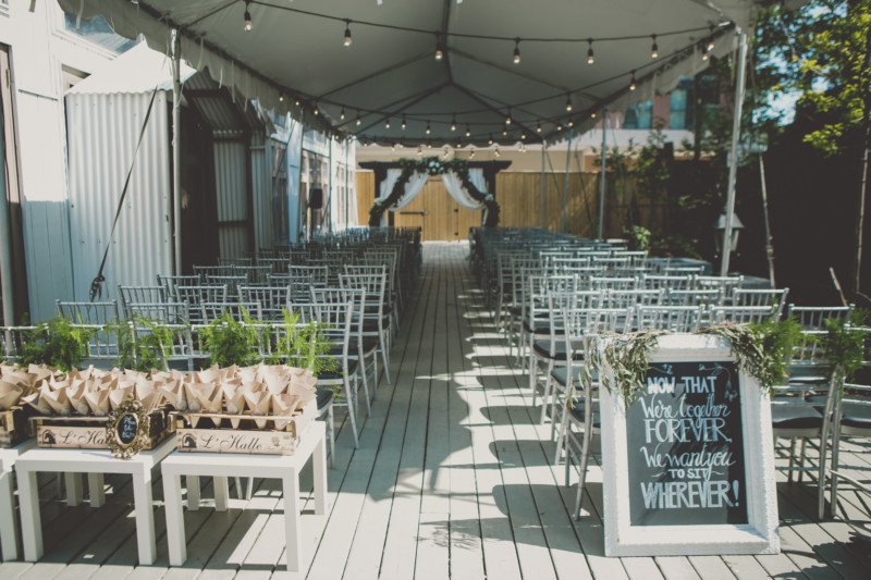
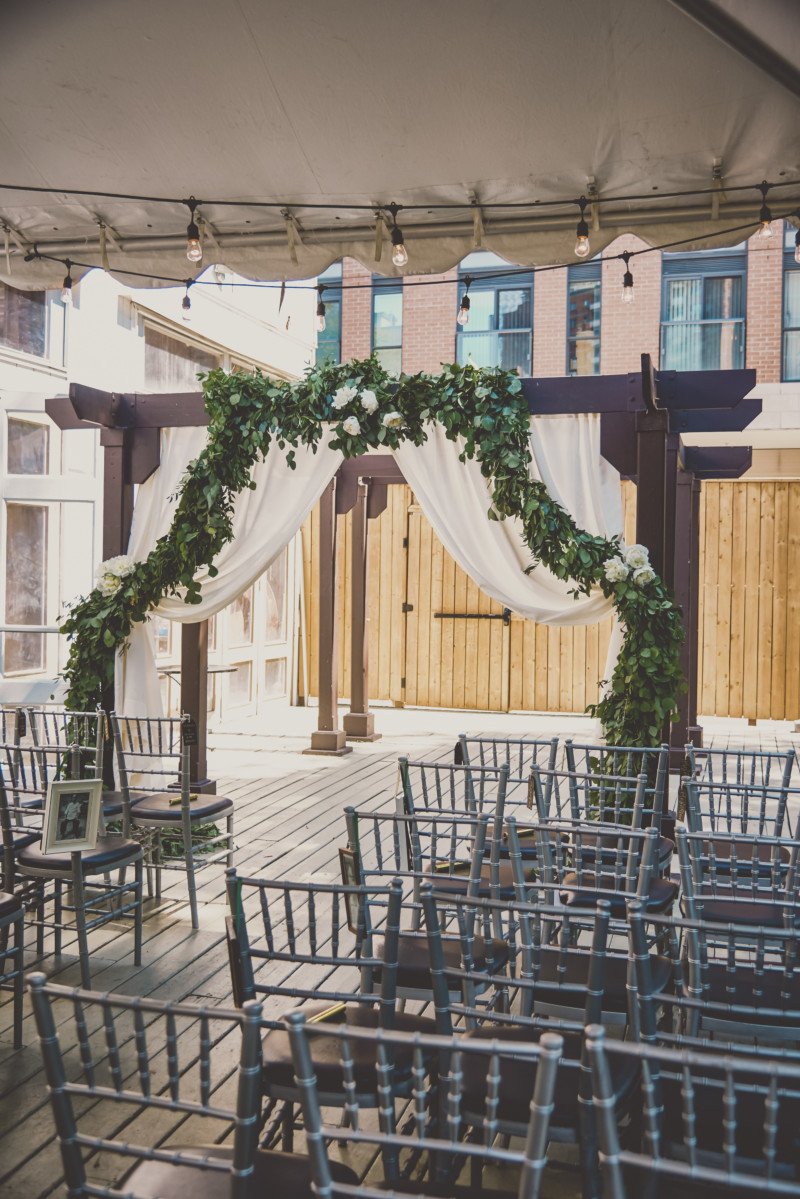
Botany Floral Studio created the gorgeous green garland that was strung under the pergola in an archway. Eunice wanted it to feel full and romantic so we chose a lovely cotton fabric and got curtains custom sewn to hang underneath. This definitely did a wonderful job of concealing the heavy wooden pergola and creating a soft and romantic focal point for the ceremony.
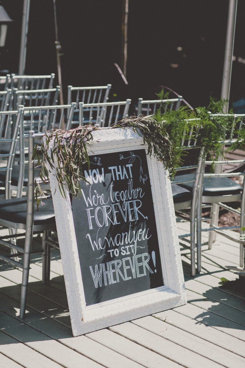
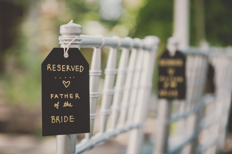
Tags were written out for all the family chairs to add a special touch for each family member.
TRIBUTES
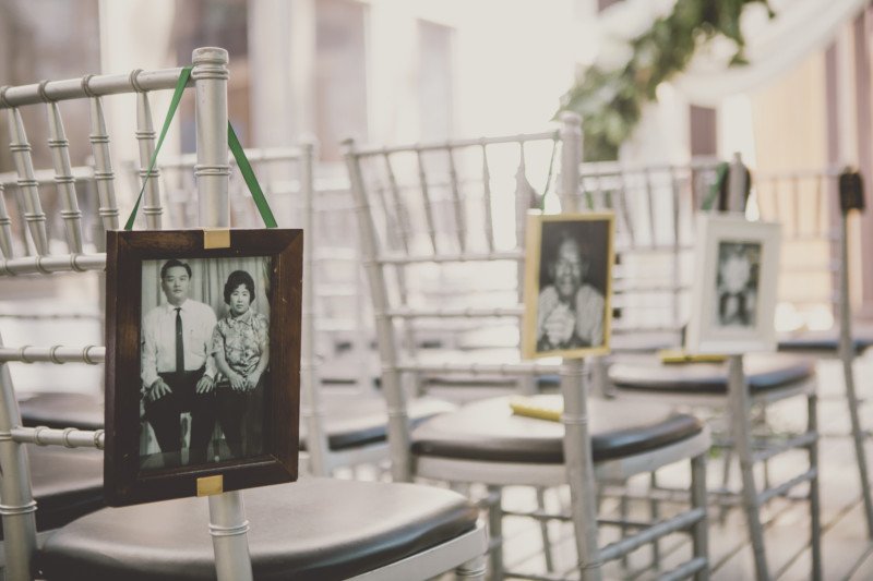
Rob and Eunice felt it was important to incorporate deceased family members that meant a lot to them into the ceremony. I converted the photos to b+w for a continuity and framed them in my collection of ecclectic vintage frames. I then attached emerald ribbon to each in a loop to hang off the sides of the family seating alongside the aisle. Eunice hand wrote tags for specific family members seating positions in chalk on black tags. This was a small but beautiful detail.
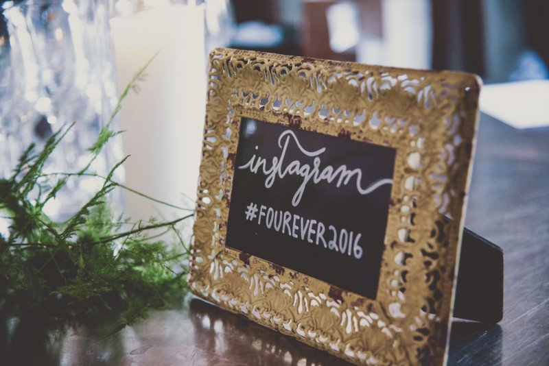
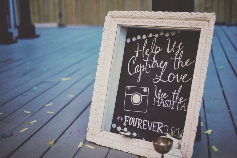
Eunice came up with a catchy #tag name for the wedding. #FOUR (was from Rob’s last name FOURNIER and FOREVER was the play on words. It was super catchy and fun for guests to hashtag throughout the night!
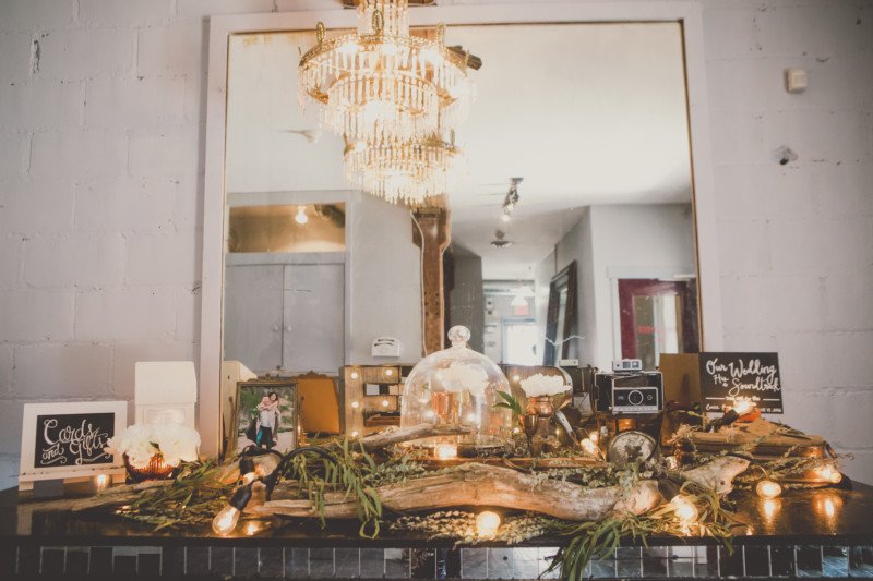
ENTRANCE TABLE
The entrance table to the reception area was decorated with ruscus, wooden logs, branches, vintage cameras, mixed copper candlesticks and vases, guests cd giveaways, twinkle lights, marquee initial lights, gift box and engagement photos of the bride and groom. This romantic display set the mood for what was to come inside.
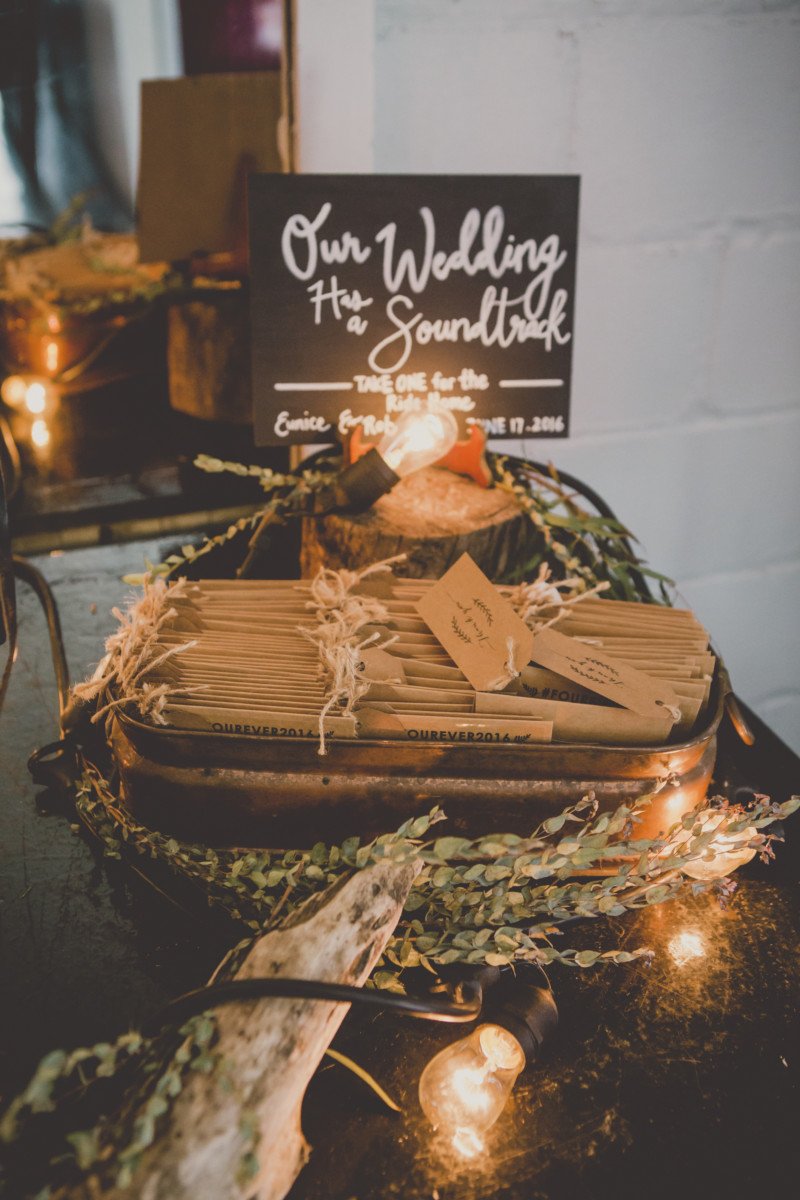
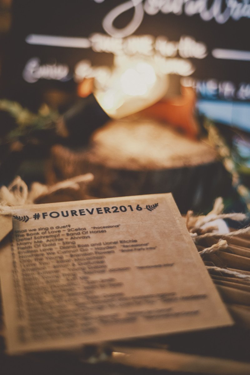
GUEST FAVOURS
The wedding soundtrack cd guest favours were another huge and personable hit mostly executed by Rob. The couple chose a list of personal favourites and arranged them in just the right sequence. Rob burned countless cd’s and I designed and created the cd label sticker for the kraft cd cover envelopes. Eunice came up with a play on their last name for their wedding hashtag #fourever which was quite cute. Rob’s last name is Fournier, so it seemed fitting. Eunice then finished off the cd’s with a hand written message on each tag attached to the cd thanking the guests. It was a very personal touch that took a lot of time for each.
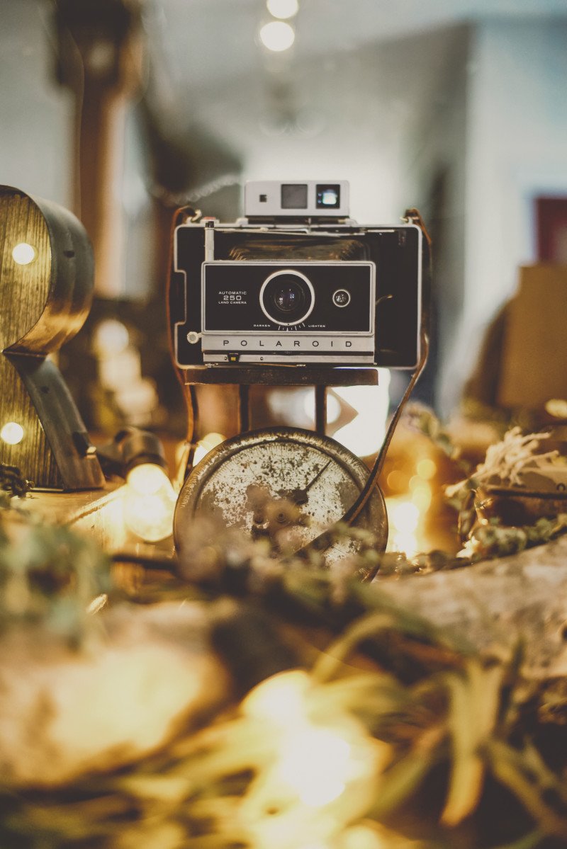
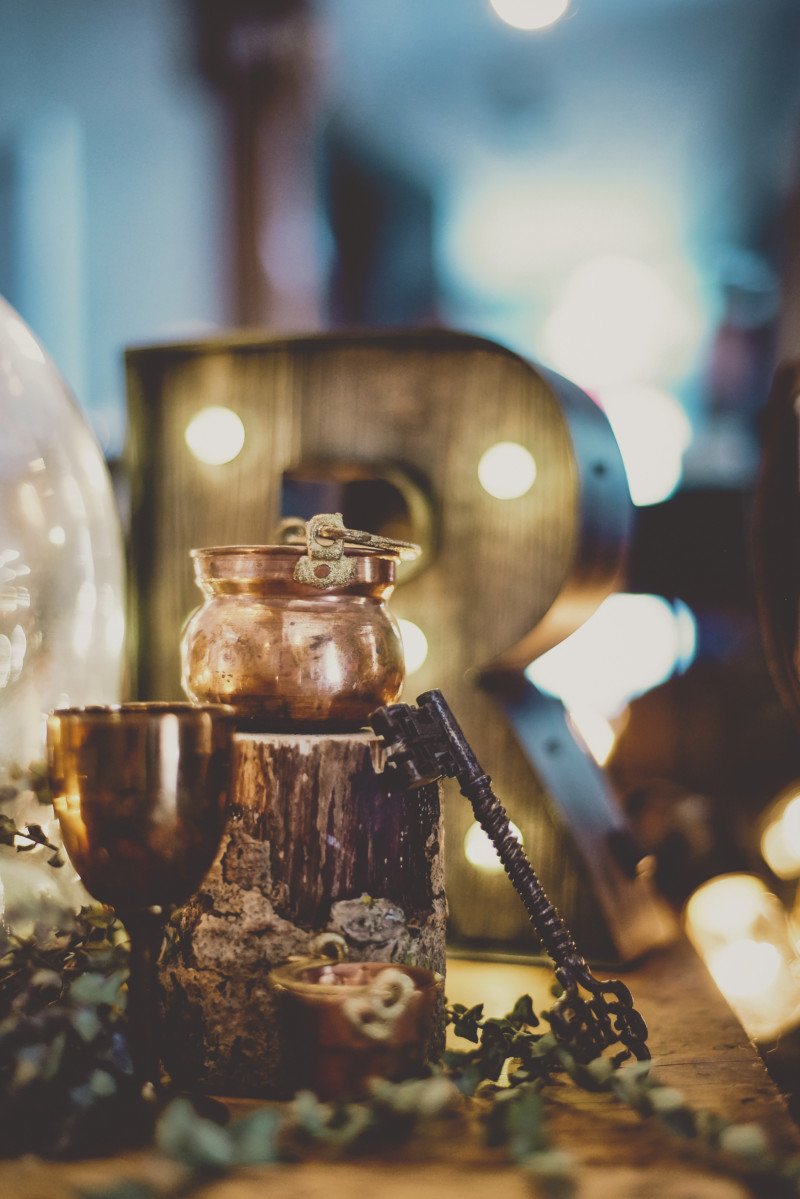
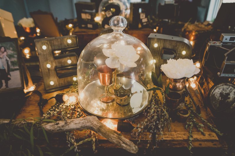
I used vintage props from Olive Studio’s collection to make this pretty welcome table. A little bit of copper, vintage cameras, twinkle lights and driftwood goes a long way!
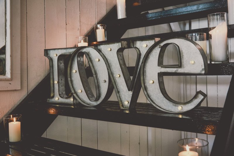
STAIRCASE TO NOWHERE
The Berkley Fieldhouse has a stiarcase to nowhere which we utlized as a romantic corner displaying photographs of the couple amid more candlelight.
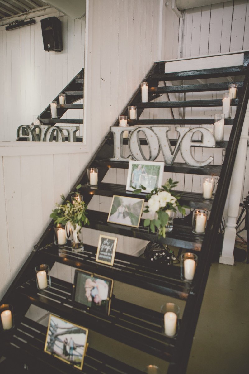
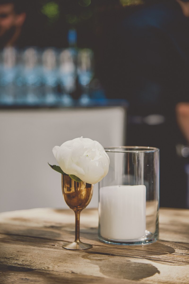
Glass votives with white candles and copper chalices dotted around the patio area.
TABLESCAPES
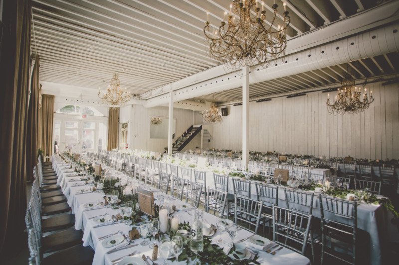
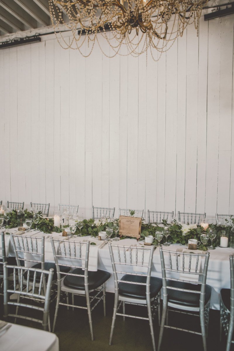
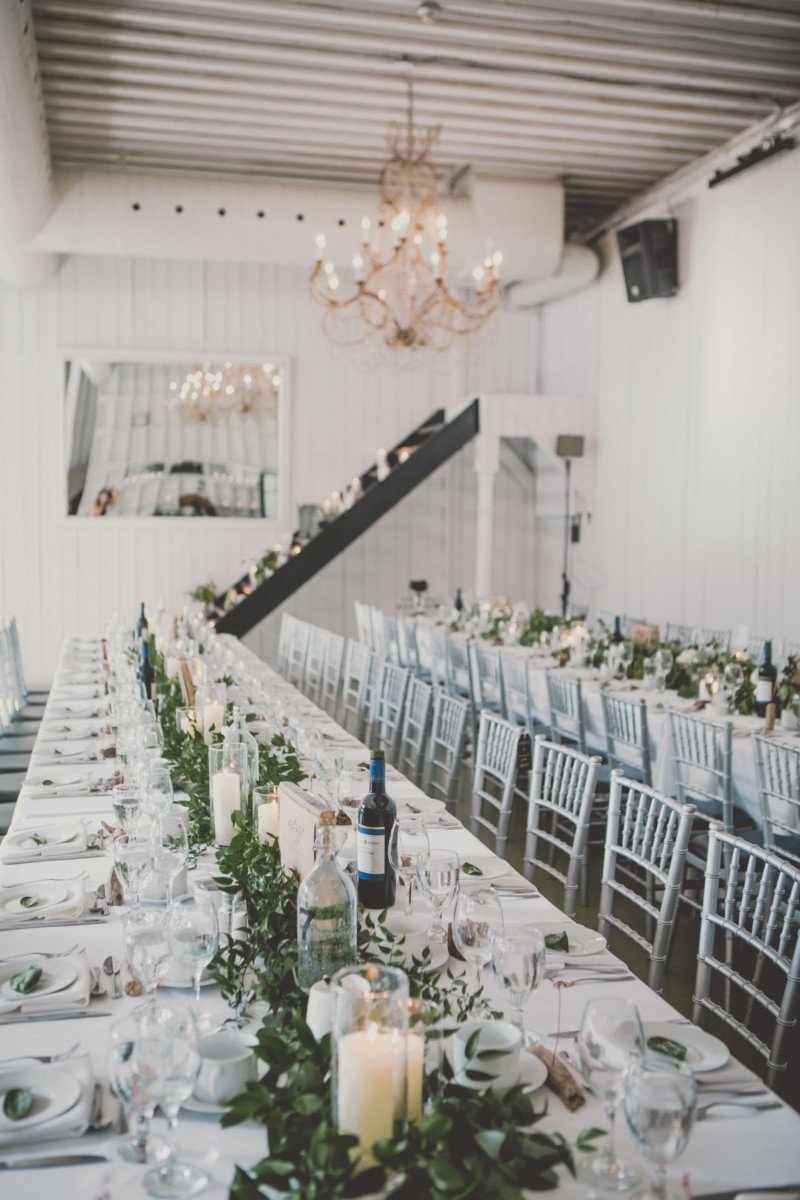
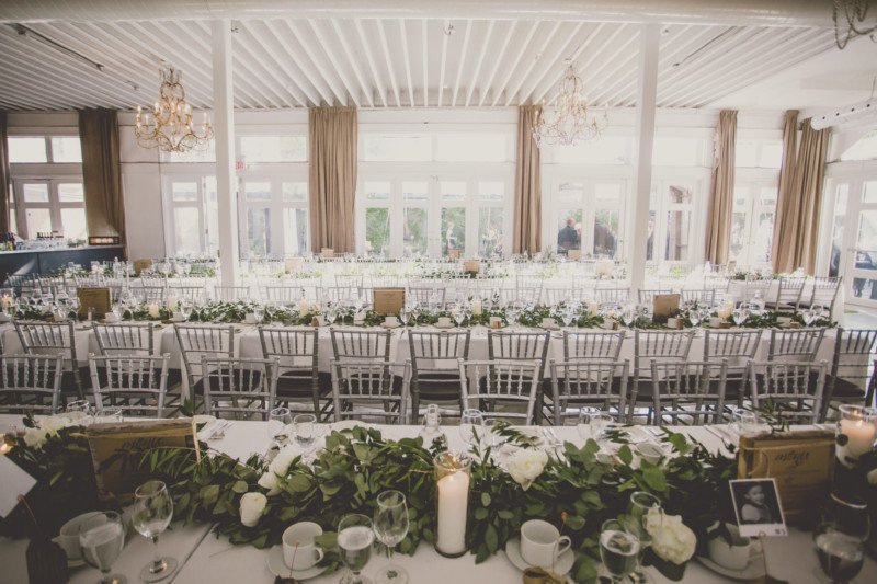
The Berkeley Fieldhouse is more rectangular than anything with a bank of windows on one long edge. I thought it was extremely important for the tables to assimulate this feeling of length by running them in harvest table style. In order to accommodate 150 guests which is the fieldhouses max, the couple upgraded their tables to 8ft lengths so that 10 people could sit at each table. This was tight but it looked stunning and actually bigger and cozier than I’ve ever seen it.
CENTREPIECE
Loose greenery by Botany was laid out along the table to give the appearance of a garland. The garland from the ceremony was repurposed as the centrepiece garland for the head table.
PLACESETTING
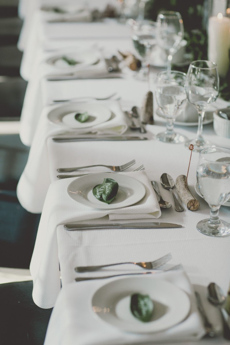
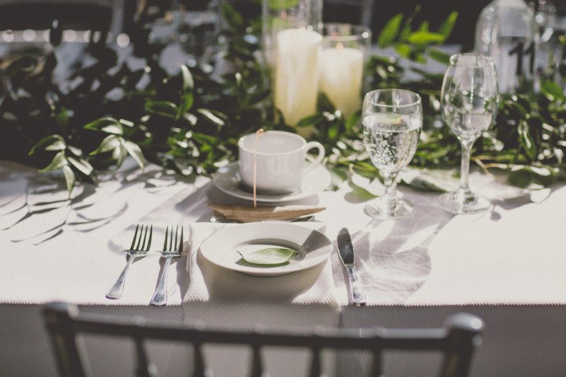
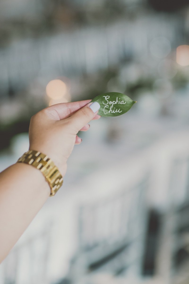
Each guest had a real leaf on their side plate which had their name hand written in white paint pen. A folded white napkin lay underneath the plate and draped over the edge of the table. At the top of the small plate was a custom piece of driftwood sourced from Georgian Bay. I cut the driftwood into tiny pieces at maximum, 3″ long. I then drilled a tiny hole to fit a piece of copper wire which would stand about 3″ high. The tip swirled around in a circle which would hold the polaroid guest baby photo. These would be driftwood name card holders. The copper wire was the tricky part to get my hands on, since it could only be purchased in electrical rubber casing which I had to painstakingly strip off!!!
LIGHTING
Eunice collected two sizes of white pillar candles from Hong Kong on her monthly work trips there (she is a flight attendant). Together, we ransacked the Dollarstore for glass pillar candle holders. Since most venues in Toronto do not allow open flame, this was our next best option. In a dream world, we both would have opted for copper candlestick holders. In the end, the glass looked expensive and allowed the candlelight to spill through in a gorgeous and ideal way for photography and romance. The candles were dotted along the garland.
MENUS
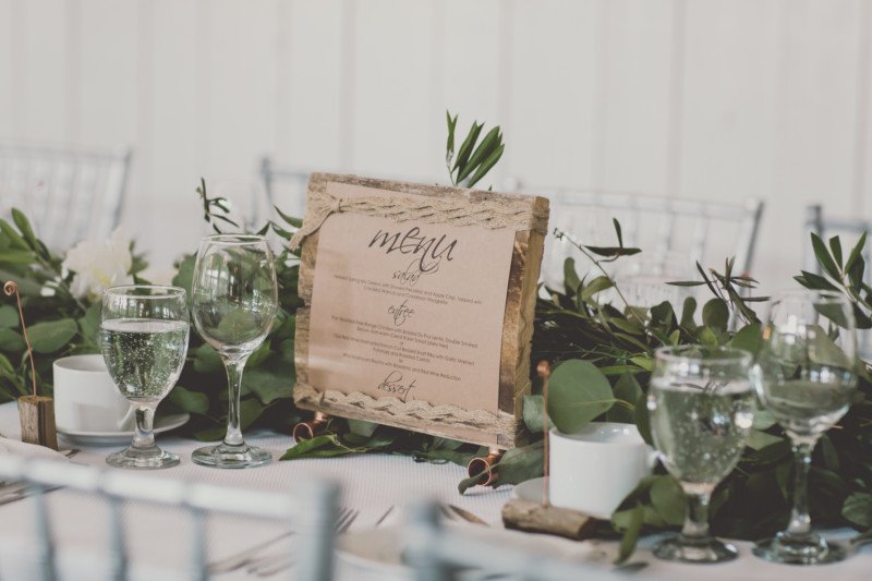
In order to cut costs on paper menus, I opted for something a little more unique and rustic. I wanted to incorporate more wood into the tablescape without making it too heavy. I at first wanted laser cut menus but that too was too expensive. I then thought that a menu could be shared by every 8 people or so, since it is just looked at quickly. I printed kraft paper menus designed by myself and then sourced barnboard from a local Ontario farmer. I cut the wood planks into pieces just big enough to display my menus. I wanted the barn board to stand up on legs and walked around home depot looking for the perfect metal accent. In the electrical aisle, I found the perfect three pronged copper pipe and purchased two for each menu board. I then drilled two huge holes for each copper pipe to be screwed into the board. These would act as the menu legs. I then found some rustic looking strings and tied a menu to each side of the barn board, so that people on either side of the table could see the menu. All in all, this project was affordable and not too time consuming.
KIDDIE CORNER
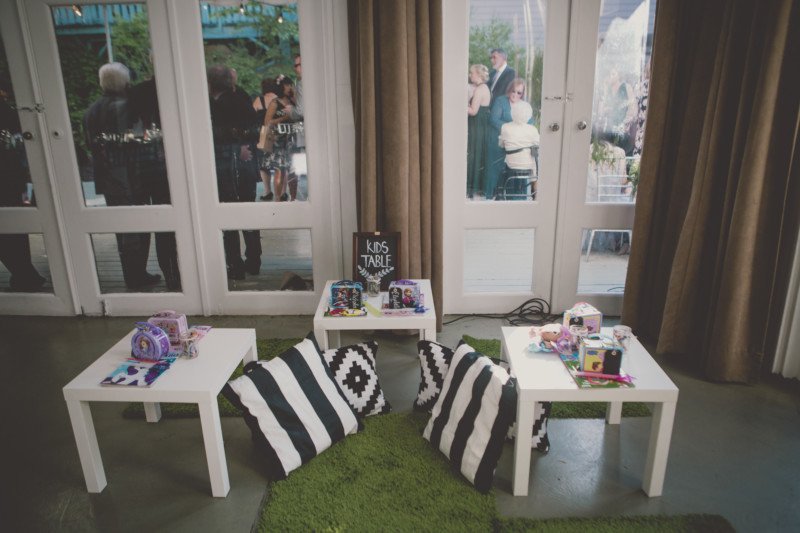
Eunice and I went on an Ikea shopping spree for our Kiddie Corner. We found a great green rug that looked like grass and graphic black and white pillows for a floor area. We used 3 white ikea tables and arranged them on the floor for the kids at the wedding to have somewhere to escape to and colour. Eunice prepared each child with their very own lunchbox with colouring books, crayons, glow sticks, candy and other odds and ends which was a sweet touch.
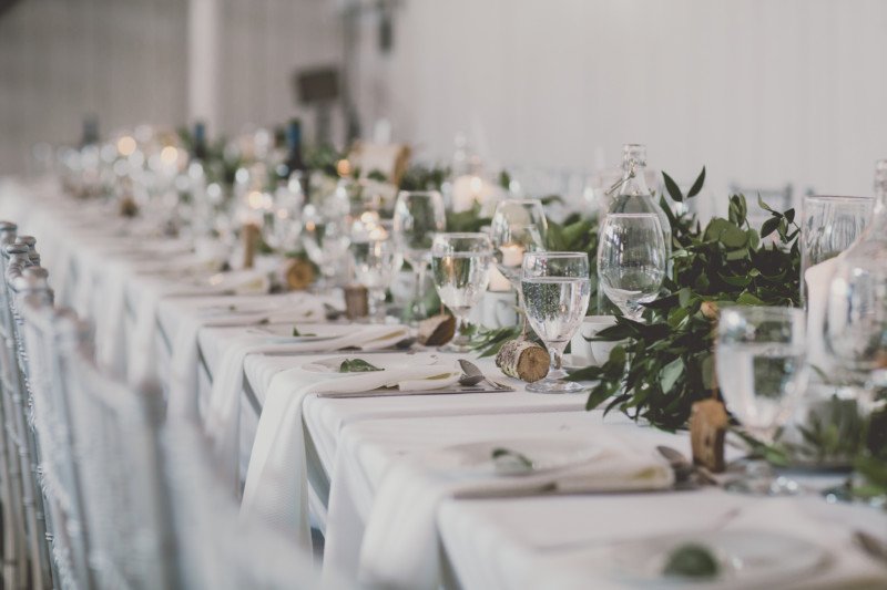
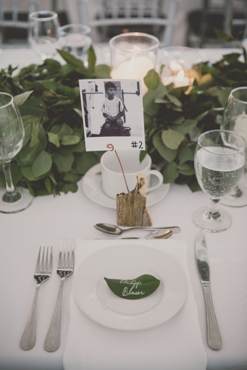
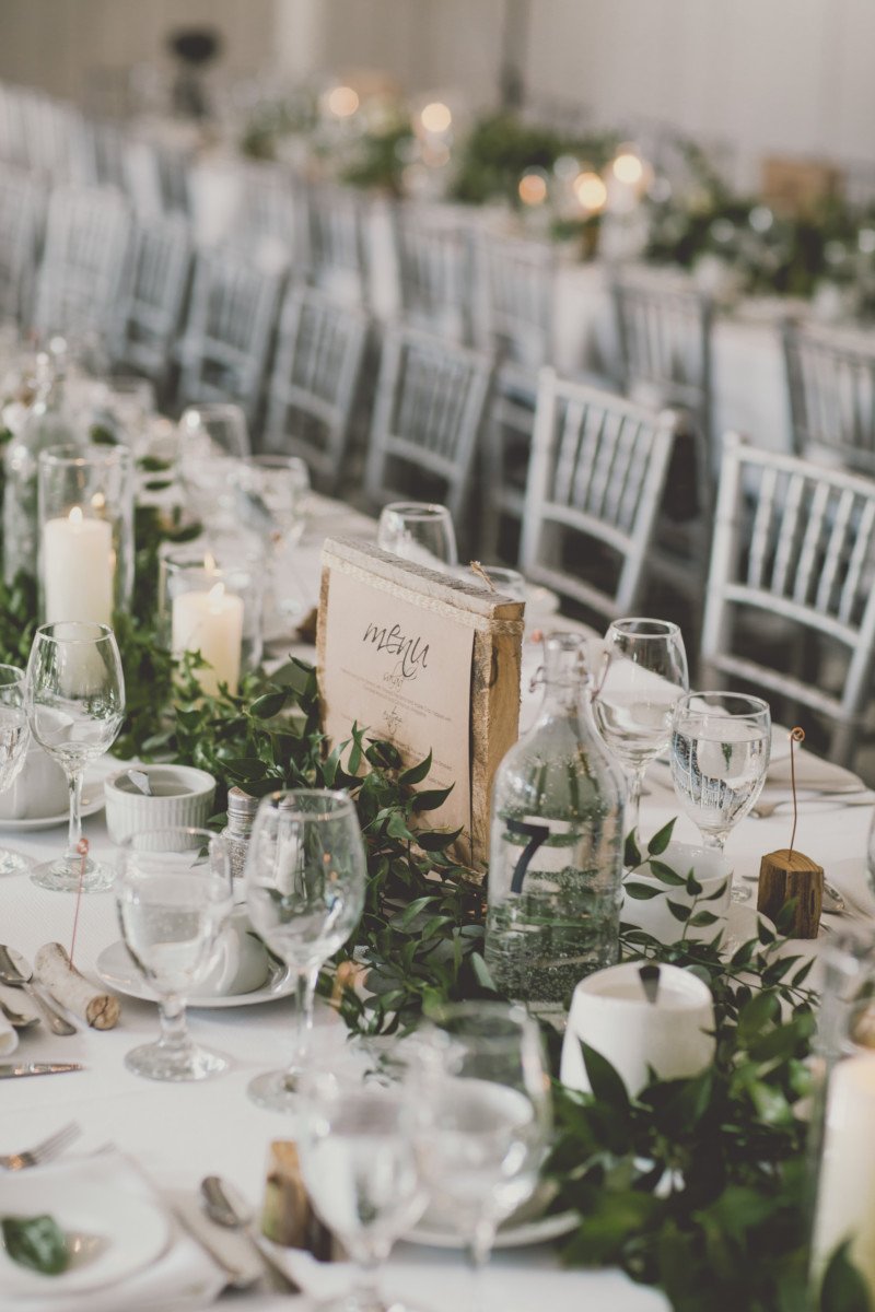
TABLE NUMBERS
In my personal opinion, the one flaw that most restaurants have is the lack of water service. I drink at least 5 glasses of water for every meal and so I am always hounding servers for more. I especially enjoy when there is a bottle of water at the table so I don’t have to feel like a pain. From my personal colelction of Ikea water bottles, I purchased some modern looking sticker numbers and adhered them to the sides of the bottles. This bottle now was dual purpose and also looked great with the glow of the candlelight.
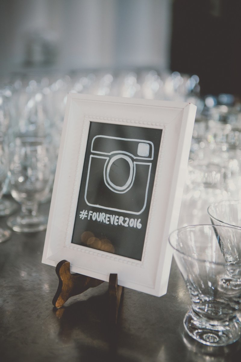
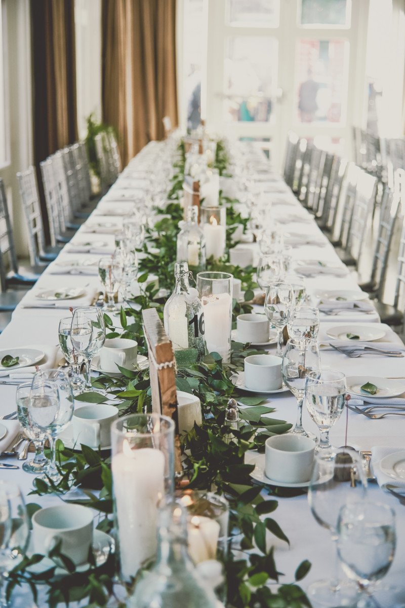
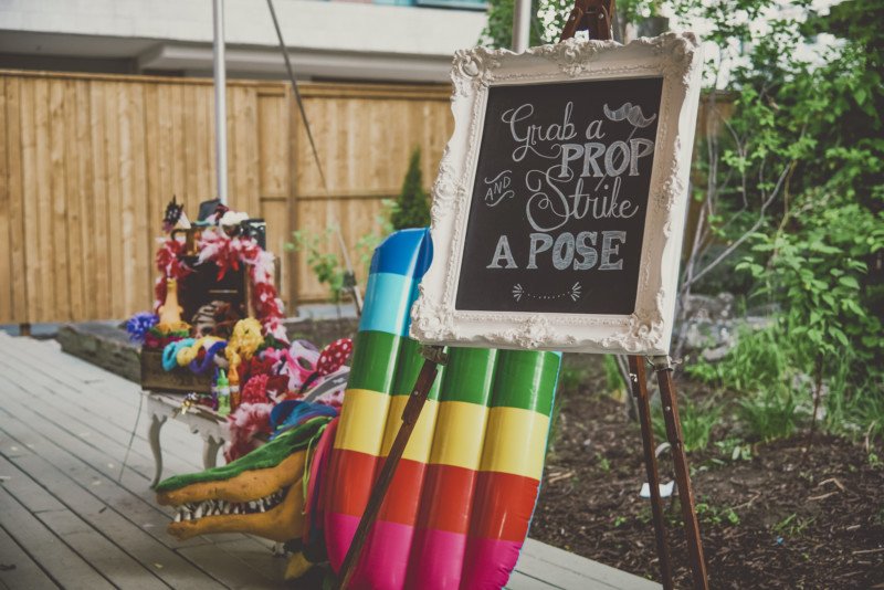
PHOTO-BOOTH
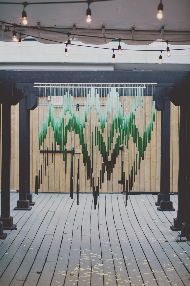
Eunice loves photos and especially loves photobooths! Since many of Rob’s friends are photographers, that was something they definitely wanted. I had this crazy idea that I got from the window at Anthropologie to make a backdrop out of paint stir sticks and over 100 hours later, it was made! ahahaha. Yes, I am nuts.
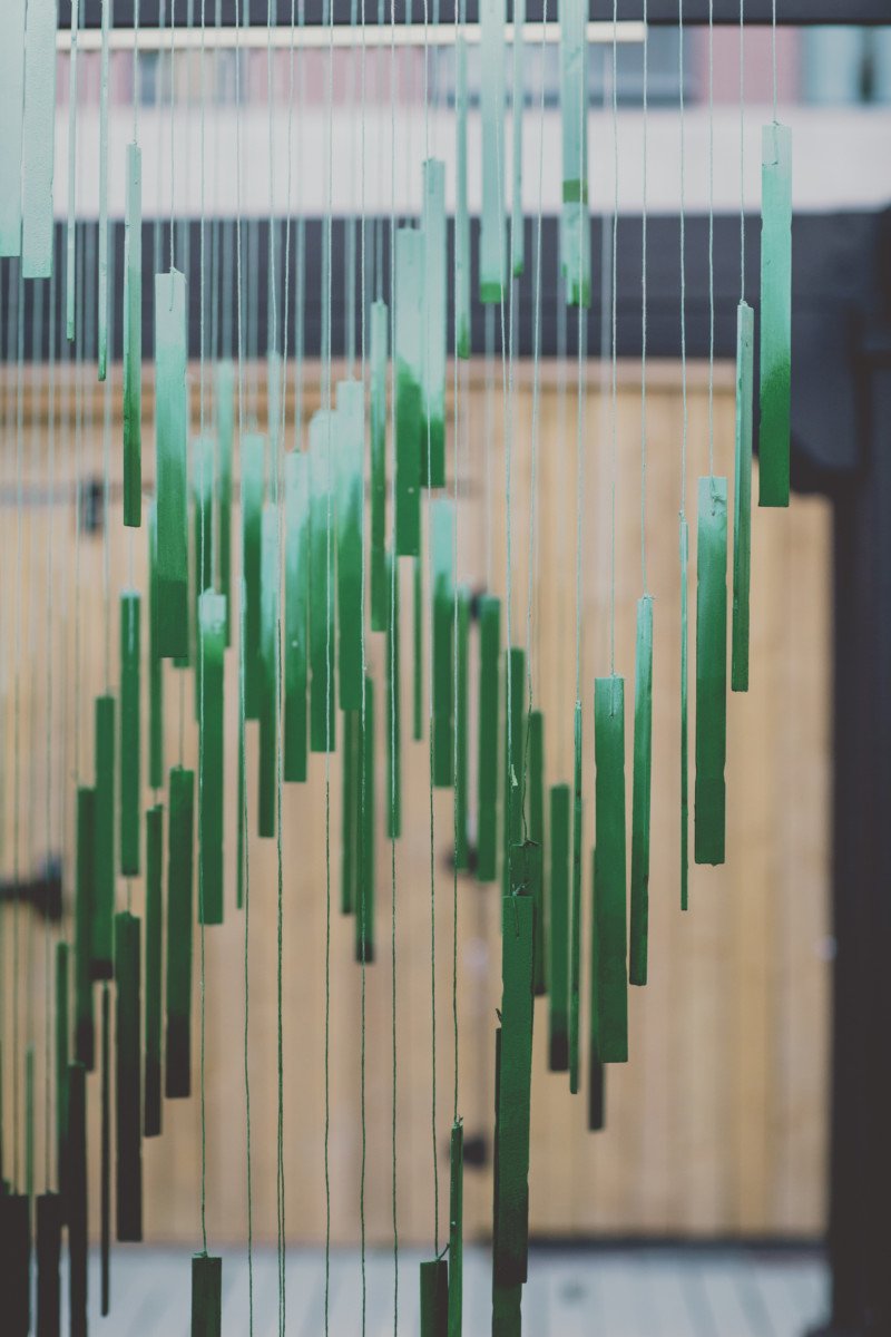
First, the collection of paint sticks was harder than I thought. No one would give them away for free so finally Rona sold them to me for cheap BUT they had a logo burned into them. I then had to sand the sticks down so that the logo wouldn’t show up.
I then pre drilled and drilled each stick at the same spot. I purchased 3 6′ wooden pieces which would act as the base. I then drilled each base every 1/2 inch alongside the wooden stick. Hanging the stick horizontally on photo stands, I then attached each a string to the base through each hole and strung the other end through the hole in the paint stir stick. I specifically hung each at a specific length to make a pattern that was appealing to the eye. I did this for each 6′ stick. I then purchased 3 tones of emerald green paint, making sure that the difference between each green was significant. I wanted to paint these sticks in an ombre pattern. I tarped my kitchen floor and got to work. At first, I thought I could dip the sticks into paint and let them drip dry, but I realized that this made a huge mess and used way too much paint so I hand painted each stick with a brush for the first coat. I started with the lightest green and worked my way to the darkest. I then used sponge and cloths to gradate each stick to a perfected ombre. I even painted the strings so they did not stick out.
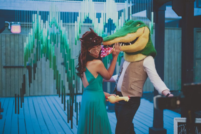
Once this was totally dry, it took about 7 hours to package it all up so that I could install it onsite and not get it tangled! I used green painters tape and wrapped each stick up to the base. At the Berekley, I installed it on the outdoor pergola which was super handy. Overall this back-drop was the most extensive and painstaking DIY I have ever taken on but I am happy with the result and now have it for rentals!
All that was needed to finish it off was photographer, David Gillespie’s props and photo talents!
MC DEE’S LATE NIGHT CART
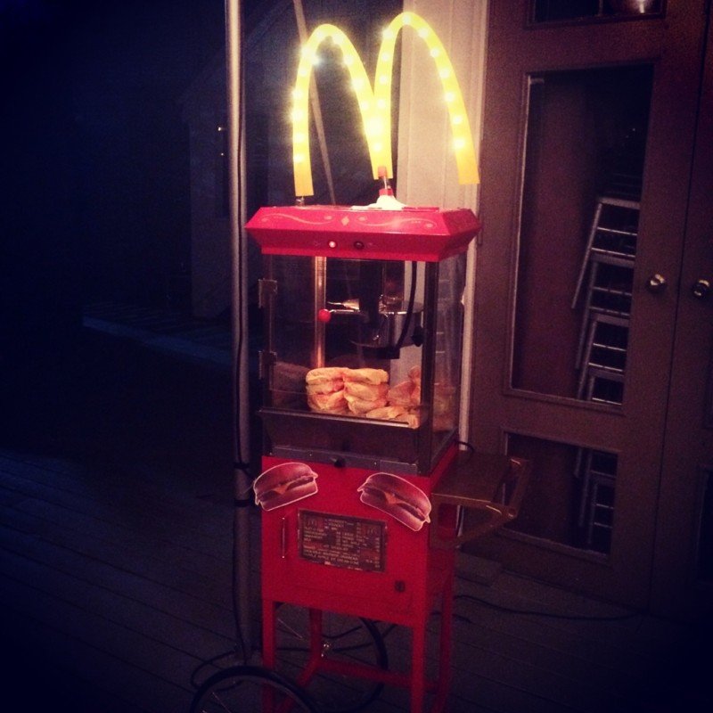
Rob and Eunice really loved the idea of a late night cheeseburger snack and there’s really no better than McDonald’s for that! Luckily one of their Uncles works for McDee’s and got them a score of cheeseburgers for midnight.
Rob’s brother has a popcorn cart that we borrowed with a heating lamp built into it. I created the McDee’s “M” logo out of laser cut birch wood and painted it bright yellow. I then drilled marquee holes through the “M” and inserted tiny twinkle lights through it. A friend of mine helped me rewire the string so it looked perfect! And voila! Our very own McDee’s cart!
——————————
ceremony + reception: Berkeley Fieldhouse // wedding planners: April Maciborka + Eunice Tng // on-site wedding coordinator: Deborah Bricks // wedding stylists: April Maciborka + Eunice Tng // styling assistant: Velsie Mak // flowers: Botany // decor photographer : Olive Studio and Ally Chadwick // stationery: Olive Studio // photobooth backdrop: Olive Studio // vintage furniture rentals, decor, signage: Olive Studio // easel rentals: Scarlet’s Table // polaroid printing: Square Snaps // custom “sign in” bench: Zack Shields // custom McDee’s Sign: Olive Studio // flower crown station: Fun Flower Stand
